The first chance a movie studio gets to procure moviegoer's attention is before unassuming people, like you and me, step foot into the theater.
Many people have come in contact with movie posters at some point during their life whether they’re collectors, enthusiasts, or everyday audience members. Movie posters are often displayed prominently outside theater as away to advertise to the public what viewings are going to be playing on their local silver screen before long.
Many people have come in contact with movie posters at some point during their life whether they’re collectors, enthusiasts, or everyday audience members. Movie posters are often displayed prominently outside theater as away to advertise to the public what viewings are going to be playing on their local silver screen before long.
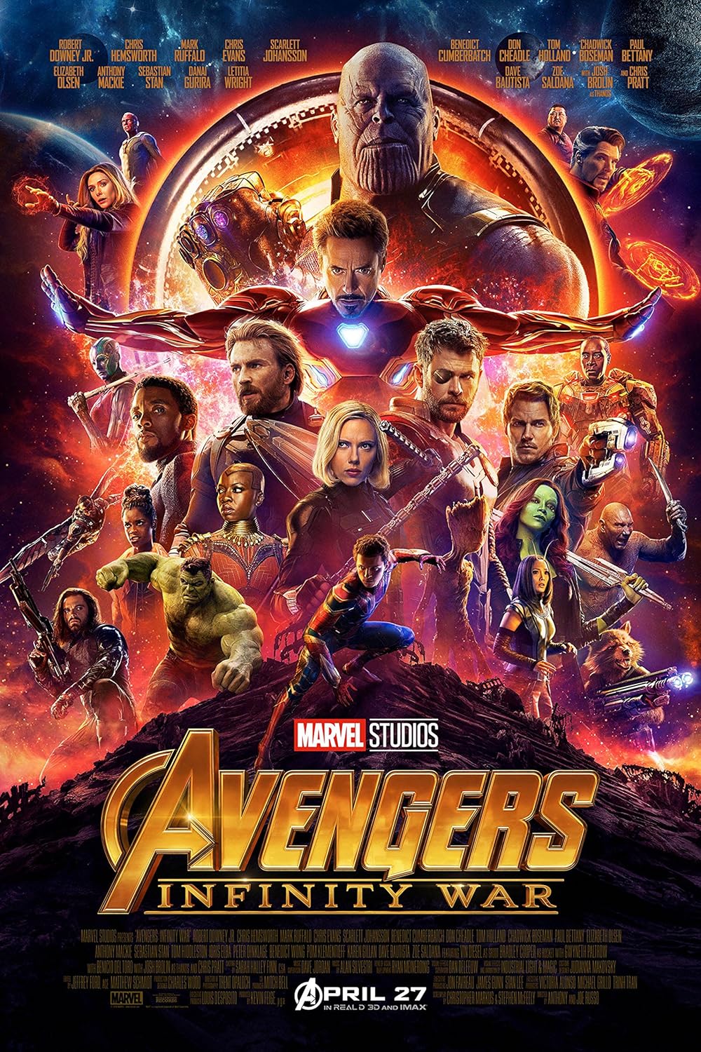
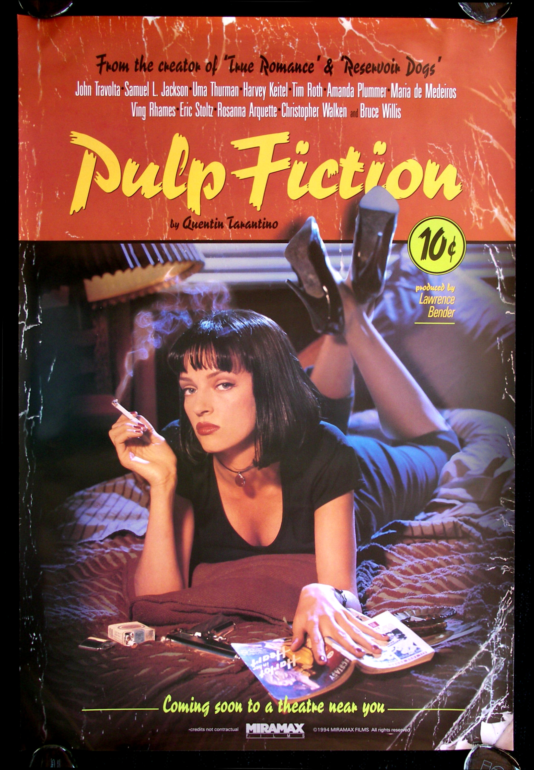
Everything has it’s conventions, things that give a certain idea or concept its identity. So I sought to answer the question as to what I thought these movie posters should, based on my assumptions, have in common. The first convention I thought of was General Information about the film, for example the title, names of actors and perhaps a release date. I then tried to dig a little deeper about what kind of message the author is trying to get across to their audience. I predicted that most posters would contain a catchy slogan of some sort, another convention, that would give a sense to the reader of what this film is about. That then led me to wonder what other emotions were these posters trying to evoke in me? Movies come in all sorts of lengths and genres, but these movie posters, as a vehicle of advertisement, aim to grab my attention. I thought of different ways a poster could do this and came up with conventions of what I considered Attention Grabbing Visuals; bright colors, more specifically red & blue, and large text displaying the title.
To test my conventions I selected three movie posters of different genres, from different eras, and different studios. I found that I was able to put a check mark next to most of the items on my list of conventions.
The convention I was most pleasantly surprised by my accuracy with was my hunch about the colors that would be emphasized. Red is the color that Pulp Fiction and The Avengers utilized, maybe to foreshadow what sort of narrative was to come in both of those films; the color blue, additionally, was painted in all different shades across foreground in Moonlight. In all instances the colors grab the onlookers attention and also portend what lies for the characters ahead. The movie posters, also, contained lot of general information about what actors would be present in some way in the film, as well as the title of the movie was clearly displayed front and center.

There were, however, some conventions I originally left out when coming up with my predictions. More specifically, all of the posters contained general information about what studios funded and filmed the movie being advertised and what director directed the motion picture. These carefully selected conventions helps to build up the movie’s credibility and provide more insight to those who are interested. All three posters also give a visual depiction of a character being portrayed in said film. This helps the audience better relate and familiarize themselves with the cast and the type of role this actor is going to be playing.
Whether the price of movie tickets is $2.50 or $10.50, movie posters have been used an effective method for studios to advertise their offerings. Movie posters have stood the test of time by being able to effectively lure in moviegoers for generations and evoking emotions before one steps foot in a theater.
Testing
ReplyDeleteMovie posters is a great example of something that can share many conventions yet be so different at the same time. All movie posters do the same thing, promote the movie. Although they all achieve the same thing, they don’t all do it in the same manner. This helped prove that no matter what the genre is, there will always be many conventions to go along with it.
ReplyDelete